
How to read a histogram: better exposure at a glance
The screen on your camera can mislead you in bright light. The histogram cannot. Learn to read it and you will know whether an exposure is right before you get home.
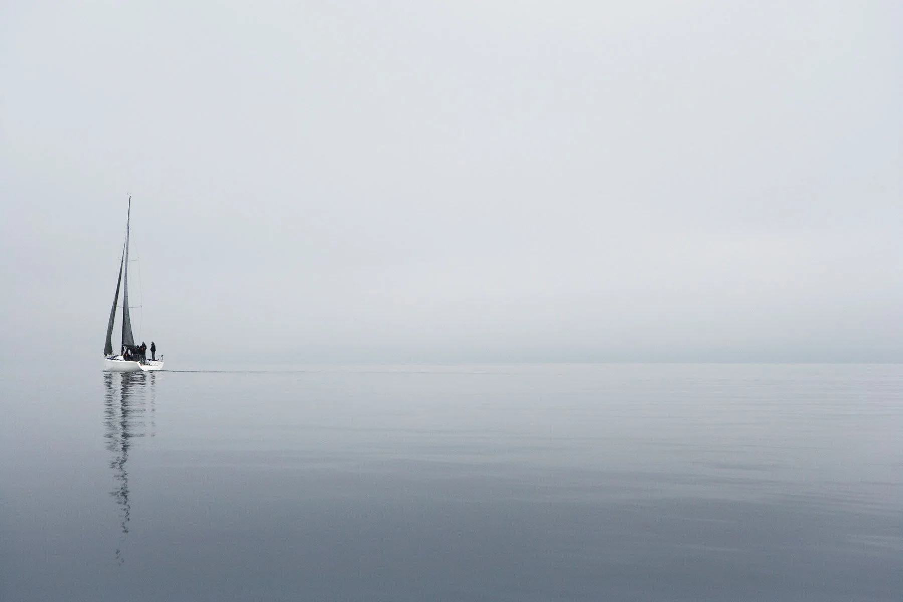
Photograph a white sailboat on a pale, misty morning and your camera will almost certainly get it wrong. The meter sees a frame full of brightness, assumes it is looking at something of average tone that is simply too bright, and darkens the whole thing. The mist turns a dull, dirty grey. The boat looks as if it was photographed through a smoky window.
The screen on the back of the camera will not always warn you, especially outdoors in daylight. The histogram will. For that scene, a correct exposure produces a graph pushed hard to the right, which looks alarming if you have been told a good histogram is a neat hill in the middle. It is not. Reading a histogram is about knowing what the scene should look like, then checking whether the graph agrees.
What is a histogram in photography?
A histogram is a graph of every pixel in the image, sorted by brightness. The horizontal axis runs from pure black on the left to pure white on the right. The vertical axis shows how many pixels sit at each brightness level. A tall peak means lots of pixels share that tone. A flat stretch means few or none.

It tells you nothing about where those tones are in the frame, or whether the picture is any good. It tells you, precisely and without being fooled by screen brightness or glare, how the tones are distributed. That is exactly the information you need to judge exposure.
Most cameras can show a histogram in live view or on playback. It usually lives in the display settings, often toggled with the DISP or INFO button. Phone camera apps with a manual or pro mode often include one too.
How to read a histogram: shadows, midtones and highlights
Think of the graph in three broad zones. The left third holds the shadows, the middle holds the midtones, and the right third holds the highlights.
What matters most is the two edges. If the graph is pressed hard against the right-hand edge, with a spike climbing the wall, some highlights are clipped: they have been recorded as pure white with no detail. If it is pressed against the left-hand edge, some shadows are clipped to pure black.
A little clipping is often fine. Specular highlights such as the sun, a streetlight or a glint on chrome are meant to be pure white, and deep shadows in a night scene can go to black without harm. Clipping becomes a problem when it swallows detail you care about: the texture of a white dress, the clouds in a bright sky, a face in shadow.
There is no correct histogram shape. There is only a correct histogram for the scene in front of you.
There is no perfect histogram
A bright, high-key scene such as snow, beach sand or morning mist should produce a graph weighted to the right. A dark, low-key scene such as a night street or a portrait against black should be weighted to the left. A foggy landscape may produce a narrow spike in the middle with nothing at either end, because fog is low in contrast. All of these can be correctly exposed.
The same logic explains why the misty sailboat went grey. Your camera's meter is designed to render a scene as a middle tone on average. When a scene is genuinely brighter than average, the meter underexposes it; when it is darker, the meter overexposes it. The histogram lets you see this happening and correct it with exposure compensation. For the sailboat, +1 to +2 stops is typical, adjusted until the graph sits just short of the right edge.
A camera also offers a highlight alert, often called blinkies, which flashes clipped areas on playback. Turn it on. Together with the histogram, it gives you a quick check of both how much is clipped and where.
RGB histograms and what your camera is really showing
Many cameras can also display three separate histograms for the red, green and blue channels. The combined luminance histogram can look safe while one colour channel is clipped. This happens most often with intensely coloured subjects: a red flower in sunlight, a blue neon sign, a vivid sunset. If the colour looks flat or loses texture on playback, check the RGB view.

There is one more subtlety. Even when you shoot raw, the histogram on your camera is based on the JPEG preview it generates, with your picture style and white balance applied. A raw file usually holds a little more highlight detail than the camera histogram suggests. That is a small safety margin, not a guarantee. Treat the camera histogram as slightly cautious.
What does expose to the right mean?
Expose to the right, often shortened to ETTR, is a technique for raw shooters. You deliberately make the exposure as bright as possible without clipping important highlights, pushing the histogram towards the right edge, and then darken the image to taste in editing.
The reason is how digital sensors record light. Raw data is linear, which means the brightest stop of exposure contains far more tonal levels than the darkest. The shadows are where noise lives. A brighter exposure, pulled down later, generally gives cleaner shadows and smoother tones than a darker exposure lifted later, particularly at higher ISO.
ETTR has limits. It only makes sense for raw files, because a JPEG has already been processed. It suits slower, considered work such as landscapes, long exposures and still life, rather than fast street or event photography. And highlights that clip are gone for good, so err on the side of caution in high-contrast light. Long exposure work at the coast is a good place to practise it, and the long exposure seascape workshop uses the histogram constantly.
Using the histogram when editing
Lightroom, Capture One and most raw editors show a histogram as you work. In Lightroom, holding the Alt key (Option on a Mac) while dragging the Whites or Blacks slider shows exactly which areas are clipping, and the J key toggles clipping overlays. Set the Whites until a few specular points just appear, set the Blacks until the deepest shadows just touch, and you have used the full tonal range without losing detail. Our private lessons include a Lightroom session that covers this in depth.

If you are still getting comfortable with exposure itself, the beginner photography workshop covers metering, exposure compensation and the histogram together, which is how they are best learned.
Practise this
- Turn on the histogram in live view and photograph a white object on a white background at the camera's suggested exposure. Then add exposure compensation until the graph sits just short of the right edge. Compare the two.
- Photograph a dark object on a black background, and correct the exposure the other way.
- On your next raw landscape, take one frame at the metered exposure and one exposed to the right. Match their brightness in editing and compare the shadows at 100 per cent.
Questions, answered.
What should a good histogram look like?
What does clipping mean on a histogram?
What is expose to the right?
Is the histogram on my camera accurate for raw files?
Published by CapturEDU, Melbourne photography education. Our educators are award-winning photographers with a Master of Arts in Photography (RMIT), AIPP and RPS membership.
