
Photography composition rules: thirds, lines and empty space
The rule of thirds, leading lines and negative space are not laws. They are shortcuts to pictures that hold the eye, and learning them properly is how you earn the right to ignore them.
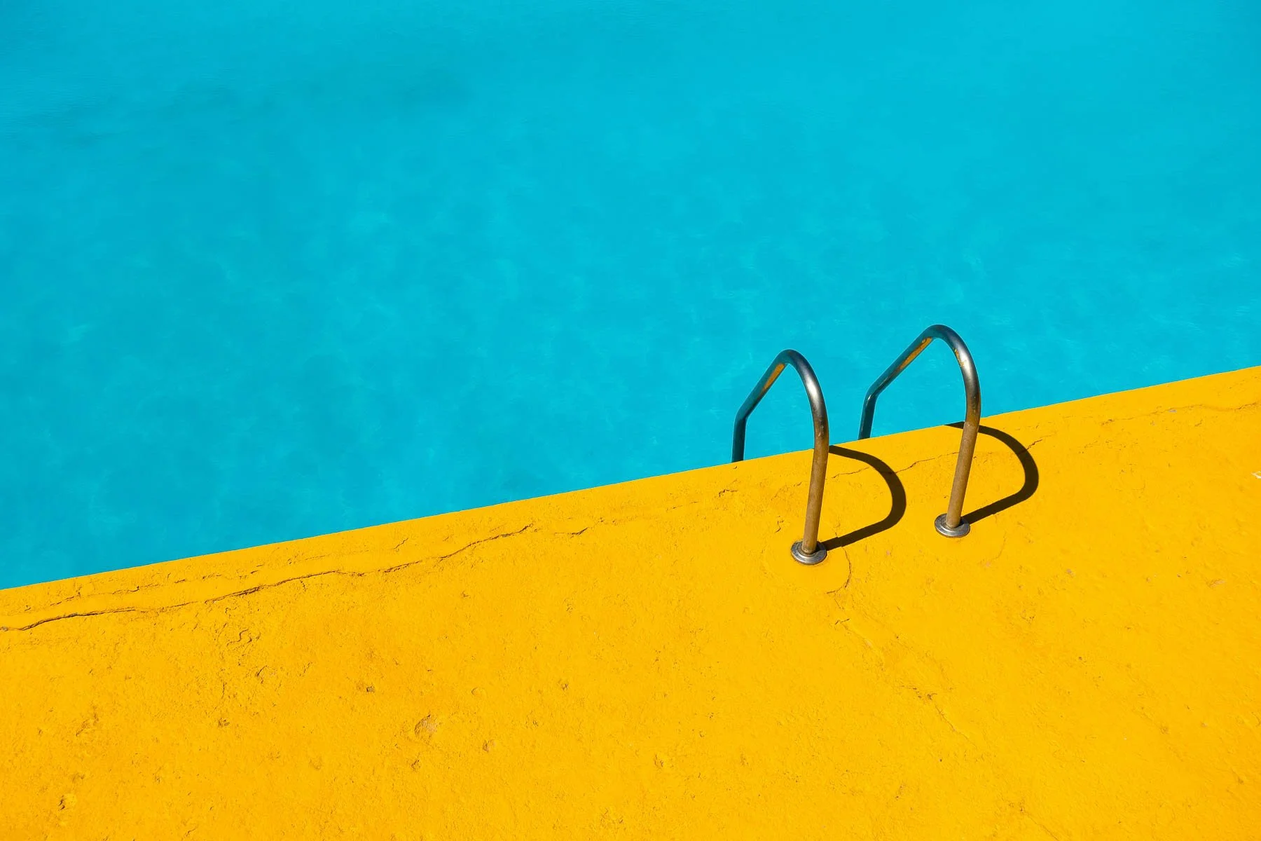
The photograph is almost nothing. A yellow pool ladder climbs out of one corner of the frame and bright blue water fills the rest. There is no horizon, no person, no event. It still holds the eye far longer than most holiday snaps of the same pool, and the reason is not the colour. It is where the ladder sits, and how much the photographer was prepared to leave out.
Composition is the set of decisions you make about what goes in the frame and where it goes. The so-called rules are not laws. They are shortcuts, borrowed from painting and refined over a century and a half of photography, that describe arrangements the eye tends to find satisfying. Learn them well enough to use without thinking and you will also learn when to ignore them.
What is the rule of thirds?
Divide the frame into three equal columns and three equal rows, like a noughts-and-crosses grid. The rule of thirds suggests placing your main subject on one of those lines, or near one of the four points where they cross, rather than dead centre.

It works because a centred subject splits the frame into two equal halves, and equal halves feel static. Shift the subject a third of the way across and the frame becomes unequal: a heavy side and a light side, with room for the eye to travel between them. Eyes on the upper third line in a portrait. A horizon on the lower third when the sky is doing the work. A lone tree on the left-hand vertical. It is the same idea each time.
Most cameras and phones can overlay the grid on the screen or in the viewfinder. It usually lives in the display or shooting menu under a name like "grid" or "framing guide". Turn it on. After a few weeks you will stop needing it.
Two refinements matter. Give moving subjects room to move into: a cyclist heading left belongs on the right-hand third, with space ahead of them. The same applies to gaze. A face looking out of the frame with its nose against the edge feels cramped. Give it space in front and the picture feels considered.
Leading lines and framing
Leading lines are any lines in the scene that carry the eye towards the subject or deeper into the picture. Roads, fences, jetties, tram tracks, a shoreline, a row of columns. Princes Pier in Port Melbourne is a textbook example: two rows of old timber piles run from your feet towards the horizon, and almost any camera position turns them into converging lines. Our guide to the best photography spots in Melbourne lists plenty more.
The strongest leading lines start near the bottom corners of the frame and run inward. Lines that enter from the side and lead nowhere, or lead the eye straight out of the picture, work against you. Get low. At knee height a jetty or a laneway gains length and its lines steepen. From standing height the same scene flattens out.
Framing is the related trick of using something in the foreground to surround the subject: a doorway, an arch, overhanging branches, the gap between two buildings. A frame within the frame tells the viewer exactly where to look and adds depth, because the eye reads the frame as near and the subject as far. The doorways of Hosier Lane and the arches around Flinders Street Station are good places to practise. The frame does not need to be complete or sharp. A dark, soft-edged shape along two sides is often enough.
Negative space and simplification
Negative space is the empty area around a subject: sky, water, a plain wall, fog. Beginners tend to fear it and fill every corner. Experienced photographers use it deliberately, because emptiness gives a small subject weight. The pool ladder works precisely because of all that blue. Crop in tight and you have a picture of hardware.
Most weak photographs do not have too little in them. They have too much.
That is the heart of simplification. Before you press the shutter, name the subject in one or two words. Then look along the edges of the frame and ask whether each thing there helps that subject or competes with it. A bin, a bright sign, a stranger's elbow, a branch poking in from a corner: each one pulls attention. Deal with them by stepping closer, changing your angle, zooming in, or opening up to a wider aperture such as f/2.8 or f/4 so the background dissolves into soft shapes.
Simplifying also means one idea per frame. A sunset, a silhouetted couple and a passing seagull might each make a good photograph. In the same picture they usually cancel each other out.
Foreground interest in landscape photography
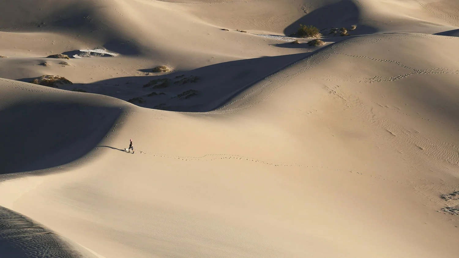
A wide landscape photographed from standing height often disappoints. What felt vast in person becomes a thin strip of detail across the middle of the frame, with a lot of dull ground below it. The fix is foreground interest: something close to the camera, in the bottom third of the frame, that gives the eye a starting point and the picture a sense of depth.
Rocks, tide lines, wildflowers, cracked mud, ripples in sand, a weathered fence post. Along the Great Ocean Road, the rock shelves exposed at low tide do the job beautifully. The technique is simple. Use a wide focal length, roughly 16–24mm on a full-frame camera. Get low and close to the foreground object, sometimes less than a metre away. Stop down to around f/8–f/11 so near and far are both acceptably sharp, and focus roughly a third of the way into the scene as a starting point.
Be selective. A foreground only works when it relates to the rest of the scene by shape, colour or line. A random rock parked in front of a sunset is still clutter.
When to break the rules of composition
Every rule above has a strong, deliberate exception. Symmetry is the obvious one. A reflection in still water, a formal façade, a long corridor, the dome of the Royal Exhibition Building: centring these is not lazy. It is the point. If you break the rule of thirds, break it cleanly. A subject slightly off-centre looks like a mistake. A subject precisely centred looks like a decision.

There are others. A horizon pushed almost to the very top or bottom of the frame when the land or the sky is the entire story. A subject jammed hard against the edge to create tension. A cluttered, layered street scene where the chaos is the subject. These pictures work because the photographer knew the conventional arrangement and chose something else for a reason.
The useful test is intention. If you can say why the subject sits where it does, the composition is yours. If you cannot, the rule of thirds is a sensible default. Practice with feedback speeds this up enormously, which is why composition runs through every one of our Melbourne photography workshops, and why the street photography workshop spends so much time on framing subjects that will not stand still.
Practise this
- Photograph one subject ten ways. Choose something ordinary, like a bench or a letterbox, and make ten frames: centred, on each third, from low, from high, framed by something, with a foreground, and with as much empty space as you dare. Compare them side by side on a large screen.
- Go looking for lines. Spend 30 minutes at a pier, laneway or tram stop photographing only leading lines, starting each one from a bottom corner of the frame.
- Subtract. Take a photograph, then three more, each time removing one element by moving your feet rather than cropping later.
Questions, answered.
What are the basic rules of composition in photography?
Should my subject always be on a rule of thirds line?
What is negative space in photography?
How can I improve my composition quickly?
Published by CapturEDU, Melbourne photography education. Our educators are award-winning photographers with a Master of Arts in Photography (RMIT), AIPP and RPS membership.
