
Composition beyond the rules: balance, weight and rhythm
The rule of thirds describes a result. Visual weight, balance and rhythm explain the cause. Understand them and you will know when a picture needs the rules, and when it needs you to break them.
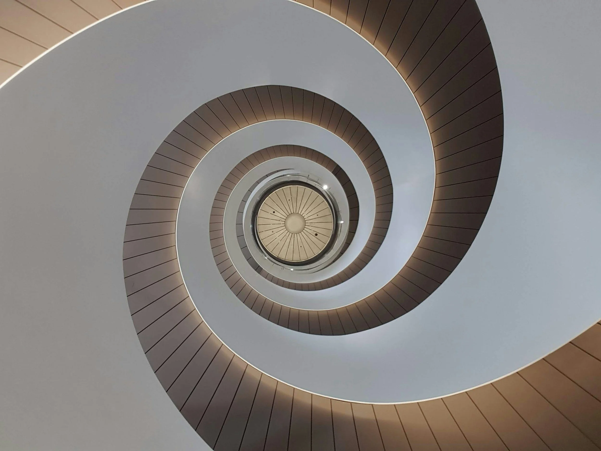
Stand at the bottom of a spiral staircase and look straight up. The steps wind inward in a tightening curve, each one a repeat of the last, until they close around a small circle of light at the centre. Put that circle dead centre in the frame and the picture works instantly. It breaks the rule of thirds completely, and nobody who sees it cares, because something stronger is holding it together: balance, repetition, and a clear path for the eye.
The familiar rules of composition, the thirds grid, leading lines, framing, are useful starting points. But they describe results rather than causes. Underneath them sit a handful of ideas that explain why a photograph feels settled or tense, calm or restless. Once you understand those, you stop asking whether a picture follows the rules and start asking what it needs.
What is visual weight in photography?
Every element in a frame pulls on the eye with a certain force. That pull is its visual weight. It does not depend on physical size alone. A small thing can outweigh a large one if it is brighter, sharper, more saturated, or more meaningful.
Some reliable sources of visual weight:
- Brightness. The eye goes to the lightest area of a photograph first, especially against dark surroundings.
- Contrast. A hard edge between light and dark draws more attention than a soft gradient.
- Colour. Warm, saturated colours, particularly red and orange, outweigh cool or muted ones.
- Sharpness. In-focus areas pull harder than blurred ones.
- People and faces. Any human figure, however small, carries enormous weight. Eyes most of all.
- Text. Words are read whether you want them to be or not, which is why a stray sign can wreck a picture.
This explains a lot of photographs that feel wrong for no obvious reason. The subject is correctly placed on a third, but a bright white car in the opposite corner outweighs it, and the eye keeps sliding away. The composition problem is not placement. It is weight.

Balance in photography: symmetrical and asymmetrical
Balance is how that weight is distributed across the frame. Think of a seesaw with the centre of the frame as the pivot.
Symmetrical balance places equal weight on both sides: a reflection in still water, a formal building façade, a corridor seen head-on. It feels calm, stable and deliberate. It also suits the centred subject, which is why the Flinders Street Station clock arches, or the dome of State Library Victoria photographed from directly below, work so well dead centre.
Asymmetrical balance offsets a heavy element on one side with a lighter element, or a larger area of empty space, on the other. A lone figure on the left third balanced by a bright patch of sky on the right. A dark tree in the foreground balanced by a small, bright boat far out on the bay. It feels more dynamic, and it is what the rule of thirds is really trying to produce.
Imbalance has its uses too. Pile all the weight on one side, with nothing to answer it, and the picture feels tense, unstable, as if something is about to happen. That is a legitimate choice, as long as it is a choice.
Rhythm, repetition and pattern
Repetition is one of the most dependable ways to organise a frame. The eye enjoys finding a pattern and then following it. The repeating arches of a colonnade, the piles of Princes Pier running out into the water, rows of beach boxes at Brighton, the ribs of a spiral staircase: each creates a rhythm the eye travels along.
Rhythm has variations worth knowing. A regular rhythm, identical elements at identical intervals, feels ordered and calm. A progressive rhythm, where elements shrink or change as they recede, pulls the eye into depth. Pier piles do this naturally with a wide lens. An interrupted rhythm is the most powerful of all: a pattern with one element different. A single open window in a wall of closed ones. One person on a long empty staircase. The break in the pattern becomes the subject.
A pattern holds the eye. A broken pattern tells it where to stop.
When you find a pattern, fill the frame with it so it seems to continue beyond the edges. Then wait. A pattern holds the eye. A broken pattern tells it where to stop. Often the stronger photograph comes when something, or someone, interrupts it.
Breaking the rule of thirds on purpose
The rule of thirds is a sensible default because it usually produces asymmetrical balance without much thought. Break it when the picture calls for something else.
Centre for symmetry. If the scene is symmetrical, centre it precisely. Use the grid lines on your screen to check that verticals are parallel and the centre line sits exactly in the middle. Slightly off-centre looks like a mistake. Exactly centred looks like intent.
Push to the edge for tension. A subject placed hard against the edge of the frame, or a horizon squeezed to the top five per cent, creates discomfort. Used deliberately, with a reason, it can say more than a comfortable arrangement.
Go small and low. A tiny figure placed near the bottom of a large, empty frame can carry the entire picture, because nothing else competes for weight. It sits nowhere near a third line, and it does not need to.
Let the pattern decide. In a frame filled edge to edge with repetition, there may be no single subject to place at all. The grid is irrelevant; rhythm does the work.

How the eye moves through a photograph
All of this adds up to one practical question: where does the eye go, and in what order? A good composition gives it a route. It lands on the heaviest element, travels along lines or patterns to secondary points of interest, and ideally circles back rather than drifting out of the frame.
Test your own pictures by looking at them small, as a thumbnail, or even upside down. Stripped of meaning, weight and balance become obvious. A frame that falls apart at thumbnail size usually has too many competing elements. One that still reads clearly is built on strong structure.
These ideas are much easier to see with someone pointing at the frame. Composition runs through every one of our Melbourne photography workshops, and our guide to Melbourne photography locations lists plenty of places with strong patterns and symmetry to practise on.
Practise this
- Choose five of your photographs and, for each, write down the heaviest element and whether it is the subject. Re-crop any where the answer is no.
- Spend an hour hunting patterns, such as windows, railings or pier piles. Photograph each one filled edge to edge, then again with something breaking it.
- Photograph one symmetrical subject precisely centred and then on a third. Compare them at thumbnail size and decide which holds together.
Questions, answered.
What is visual weight in photography?
What is balance in photography?
When should you break the rule of thirds?
What is rhythm in photography?
Published by CapturEDU, Melbourne photography education. Our educators are award-winning photographers with a Master of Arts in Photography (RMIT), AIPP and RPS membership.

